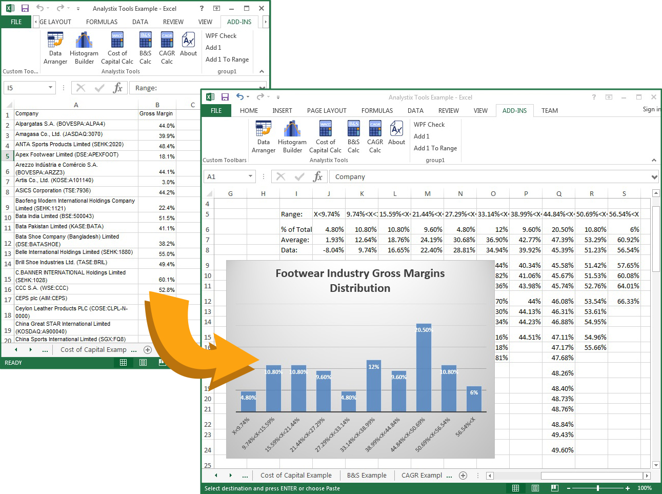
Histogram Builder- Introduction
Financial analysts often need to analyze the characteristics of a large amount of numeric data, and one of the best ways to do this is by creating a histogram. Histograms visualize data by showing you its graphical distribution and offers a much better way to analyze it compared to relying the average or median.
For example, if you have historic data of the value multiples of a company, instead of just comparing the current multiple to the historic average, you can create a histogram of the historic data and see if the simple average is a reliable representative measure of the historic behavior. Another example, you can compare the profitability of a company relative to its industry by creating a histogram of gross margins of companies in the industry, which, again, will give you a better understanding of the data compared to the average or median profit margins. By using an arithmetic average you assume that the data is normally distributed, which is often not the case, while a histogram can show you the true distribution.
The Histogram Builder Add-in found in the Analystix Tools package is designed to help you create histograms with just a few clicks of a button. It takes a series of numerical data as an input, shows you its characteristics and creates a histogram according to your specifications. You can compare the distribution of your data to a normal distribution and choose the ranges and quantity of the bins. The output can produce a bar or line charts and it can also arrange the raw data according to the histogram bins.


