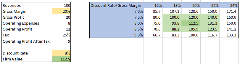
A sensitivity table is a fundamental tool in financial analysis that enables us to observe the impact of changes in multiple variables on a dependent variable. For instance, we can create a sensitivity table to illustrate how variations in the gross profit margin and discount rate affect the company’s value:
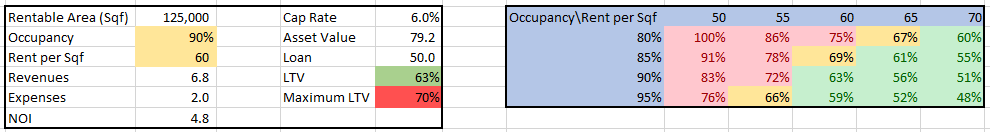
Similarly, we can examine the effect of alterations in rents and cap rates on the Loan to Value (LTV) ratio of a loan for an office building:
While sensitivity tables are commonly used in financial analysis, the available online resources often focus on the technical aspects of creating them using Excel, offering little explanation of their theoretical aspects and applications. Questions arise regarding the selection of independent variables and the range of values to consider. Moreover, what insights can be gleaned from sensitivity tables? In this tutorial, I aim to address these queries, showcasing the theoretical aspects and applications of sensitivity tables while also suggesting best practices. While a brief overview of the technical process will be provided, more comprehensive guides on this aspect are readily available, and I will provide links to such resources. This tutorial is structured as follows:
- What is a sensitivity table?
- Insights derived from sensitivity tables.
- Constructing a sensitivity table: Guidelines for selecting variables.
- Examples illustrating the use of sensitivity tables and tips for enhancing their visual presentation.
- Lastly, I will explain how to create sensitivity tables using MS Excel, while directing readers to additional technical guides for more detailed instructions.
By delving into these sections, readers will gain a comprehensive understanding of sensitivity tables, their significance, and how to effectively utilize them in financial analysis.
What is a sensitivity table?
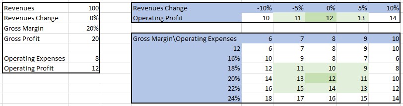
A sensitivity table serves to demonstrate the impact of one or two variables on another variable that is influenced by them. Let’s consider an income forecast calculated by multiplying revenues with the gross profit margin and subtracting operating expenses. In this scenario, we can construct a sensitivity table that showcases the operating income under different assumptions for revenues, gross profit margin, and operating expenses:
Typically, a sensitivity table highlights the base case and the range of possible outcomes.
Sensitivity tables are primarily employed for two purposes: testing scenarios and assessing risk.
- Testing Scenarios: Our reports and valuations may be used by individuals with different assumptions than ours. To provide them with valuable insights, we can demonstrate how the result changes by incorporating their assumptions. Since each user may have distinct assumptions, a sensitivity table becomes an effective way to illustrate the impact of using alternative assumptions. For instance, if someone believes that a gross margin of 20% is too high and a margin of 16% is more likely, they can readily observe the resulting changes in the sensitivity table. Generally, sensitivity tables are created for the key variables that drive the outcome, but they can also be used to demonstrate that changes in certain variables have minimal effect on the outcome.
- Assessing Risk: Risk can be defined as the probability of receiving an outcome different from what was expected. Two factors come into play: the probability and magnitude of change. For instance, a bet with an 80% chance to receive $100 and a 20% chance to receive $70 is riskier than the same bet with probabilities of 90% and 10%. Here, the difference lies in the probability. Similarly, a bet with an 80% chance to receive $100 and a 20% chance to receive $70 is riskier than a bet with an 80% chance to receive $100 and a 20% chance to receive $80. In this case, the difference lies in the magnitude of the change. Sensitivity tables offer an excellent tool to demonstrate the effects of both probabilities and magnitudes of change. If we observe significant variations in the result due to slight changes (in terms of probability) in the key variables, we can conclude that the risk is high, and vice versa. Personally, I find sensitivity tables to be one of the best ways to visualize and comprehend risk, as they showcase the effects of multiple changes to the assumptions. To use this method effectively, the values of the independent variables should be based on the probability of their occurrence.
By employing sensitivity tables, analysts can gain valuable insights into different scenarios and assess the associated risks, contributing to a more comprehensive and informed financial analysis.
Constructing Sensitivity Tables: A Best Practice Guide
Dependent Variable
The dependent variable is the variable we want to examine, which changes based on variations in the independent variables. In our previous example:
The dependent variable is net income. It is typically the outcome of a calculation. For instance, in firm valuation, the dependent variable is the valuation of the company. As part of the valuation report, we might discuss the company’s leverage, creating a sensitivity table to show the future leverage (e.g., equity-to-total-assets ratio) based on changes in forecast parameters (e.g., dividend distribution).
The dependent variable can take the form of a number (e.g., equity valuation of $400, net income of $100), a ratio (e.g., equity-to-assets ratio of 40%, net income margin of 12%), or a percentage change from the base case (e.g., 10% increase in value). While number or ratio-dependent variables are primarily used when constructing sensitivity tables to test scenarios, using percentage changes from the base case is more appropriate when assessing risk. For instance, it is more informative to show that net income decreases by 27% when gross margins decrease by 300 basis points, rather than stating that it decreases from $75 to $55.
Independent Variables
The independent variable(s) are the variables that drive changes in the dependent variable we wish to analyze. The selection of these variables depends on the purpose of our test. In most cases, our goal is to demonstrate the effect of the main variables influencing our calculation. Typically, 2 to 6 independent variables are chosen based on the following criteria:
- They are likely to differ from our base case, as we estimate that the probability of our base case being accurate is not very high.
- A probable change in their values will result in a significant change in the outcome.
For example, when valuing a bus operation company, our independent variables are likely to include:
- Quantity of passengers (drives revenues, significant impact on the outcome)
- Fuel price (significant impact on the outcome and expected to deviate from the base case)
If we find that a variable, which initially appears important or significantly different from our base assumption, does not materially affect the outcome, we can mention it in the text. If it is important for us to demonstrate that the outcome remains relatively unchanged, we can include a sensitivity table to reflect this. For instance, in the case of the bus company, the selling price of buses at the end of their lifespan may seem important, but it has minimal impact due to significant depreciation. In this scenario, we might want to include the small effect of changing the selling price of the buses on the company’s value and label it as a non-material risk.
After determining the independent variables, we need to select the values for their sensitivity analysis. For example, if our base assumption is a gross margin of 20%, how do we choose the range of values to test? Should we show the effect of a gross margin range from 10% to 30% in 1% intervals, or perhaps from 14% to 26% in 3% intervals? Should the spread between values be even?
If we have specific scenarios we want to test, such as rent prices in our office building ranging from $50 to $60 per sqf due to ongoing negotiations, we would use the values corresponding to those scenarios.
When predetermined scenarios are unavailable, the best practice is to determine the values of independent variables using their distribution. Let’s explore this approach through an example:
Suppose our goal is to forecast the operating profit of Target for 2022 using a simple model that takes into account the forecasted revenues and operating profit margin as independent variables. These variables have a significant impact on the result. To establish our analysis, we will utilize the last 30 years as our data sample.
For the revenues, let’s assume that the 2021 revenues were $106 billion, and we will forecast their annual growth rate using the historical average of 7% (note that these assumptions are for illustrative purposes and may not reflect the actual figures for Target). To understand the distribution of the real change in sales each year, we can create a histogram. Here is an example:
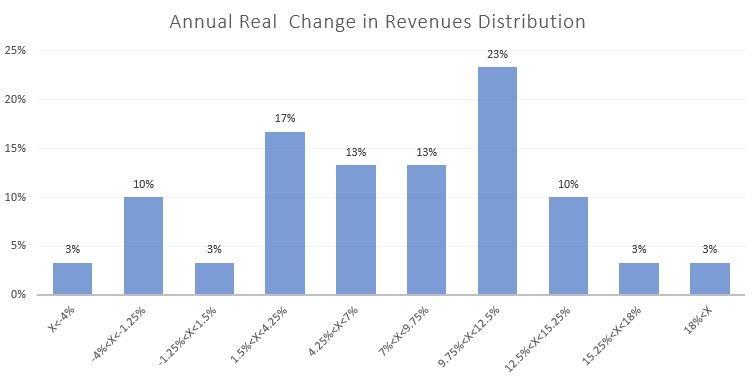
Based on the histogram, we observe that approximately 66% of our sample falls within the range of 1.5% to 12.5% annual real change in revenues. In statistics, a normal distribution typically has about 68% of the values within 1 standard deviation from the average. Therefore, the range of 1.5% to 12.5% change in revenues roughly corresponds to 1 standard deviation from the average.
To construct a sensitivity table that reflects probable outcomes, we can select values for the revenue growth. I would recommend using 1.5% and 12.5% as the edge values, 7% as the middle value (representing our base case), and the average of the edge and middle values for the 2nd and 4th inputs. Consequently, the possible values of revenue growth in the sensitivity table would be: -1.25%, 2.75%, 7%, 9.75%, 12.5%.
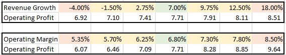
If we want to include more extreme outcomes, we can add values roughly equivalent to 2 standard deviations from the average, which are approximately -4% and 18% (as 2 standard deviations include about 95% of the values). In this case, the values for the sensitivity table would be: -4%, -1.25%, 2.75%, 7%, 9.75%, 12.5%, 18%. Additionally, it would be prudent to include a remark stating that the edges represent 2 standard deviations and the range of -1.25% to 12.5% corresponds to 1 standard deviation from the average.
Now, let’s apply the same method to the operating profit margin. The most recent margin was 8.5%, while the average margin over the past years is 6.8%. Specifically, in 2018 and 2019 (pre-COVID-19 years), the margins were 5.6% and 6.1% respectively. For our base case, let’s use the average of 6.8%. Similar to the revenue analysis, we can examine the distribution of the operating profit margin using a histogram:
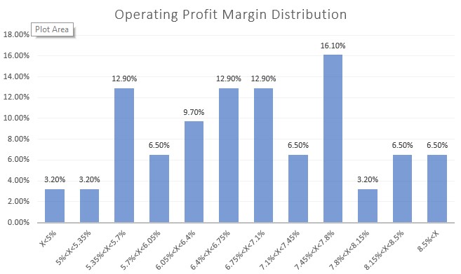
Upon analyzing the distribution histogram, we can observe that approximately 65% of our sample falls within the range of 5.7% to 7.8% for the operating profit margin. We can consider this range as our set of possible values, similar to our approach with the revenue change. However, to incorporate more extreme potential values, we need to examine the outliers in the distribution histogram.
Upon closer examination, we notice that the distribution of the first three bins differs from that of the last three bins. To account for this, I suggest using the average of the three edge bins on each side. We can assign 5.35% as the value for the first bin and 8.5% as the value for the last bin. Consequently, the values for the operating profit margin in our sensitivity table would be: 5.35%, 5.7%, 6.25%, 6.8%, 7.3%, 7.8%, 8.5%.
Although the spread between these values may not be even, it better aligns with the distribution of historic outcomes. Naturally, it is important to include a note indicating that the range of 5.7% to 7.8% corresponds to approximately 1 standard deviation from the average, while the edges represent the average of the rest of the historic sample (approximately 1.4 standard deviations from the average).
Since the two independent variables employ different distributions for the outliers (2 standard deviations for the change in revenues and 1.4 standard deviations for the operating profit margin), and the likelihood of both variables exceeding 1 standard deviation from the average is low, I recommend presenting three sensitivity tables:
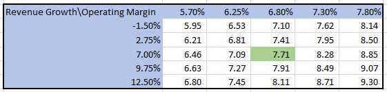
- Sensitivity table for the two independent variables using 1 standard deviation as the edge values.
- Sensitivity table for the change in revenues with a range of 2 standard deviations (utilizing the base case operating profit margin as the input).
- Sensitivity table for the operating profit margin with a range of 1.4 standard deviations (utilizing the base case change in revenues as the input).
By employing these three tables, users can gain insights into the range of probable outcomes and explore the results of extreme yet plausible scenarios.
If we decide to deviate from using the historic average operating margin as our base case and opt for a different value, we would need to calculate the historic changes in operating margins. In this scenario, the base case would entail a 0% change, and the values in the sensitivity table would correspond to a 1 standard deviation in the change of operating margins.
To summarize the proposed “best practice” approach:
- Identify the independent variables that will be displayed in the sensitivity tables.
- Determine the base case for each variable.
- Analyze the distribution of the values of the independent variables or the distribution of the changes in those values.
- Set the base case as the middle bin and assign the values within 1 standard deviation from the average as the edge bins. This range should cover the probable cases.
- If you wish to showcase extreme yet plausible cases, include values corresponding to a higher standard deviation from the average.
- Provide a note that describes the probability associated with the chosen values (e.g., 1 standard deviation for the range X to Y, 2 standard deviations for the edges).
It is essential to keep in mind that the assigned values are based on their distribution and their distance from the average. This approach ensures that two values with the same distance from the base case value have roughly the same probability. Furthermore, by setting the base case as the middle bin, users will perceive that the outcome can vary in both optimistic and pessimistic directions, avoiding any bias in the selection of values.
Now, let’s delve deeper into how sensitivity tables can help determine risk. By constructing sensitivity tables for valuing two companies or assessing loan-to-value (LTV) ratios for two companies using the same independent variables, we can easily compare the differences in risk. We observe that a 1 standard deviation change in the independent variables results in an X% value change for one company and a Y% change for the other. Since the probabilities of such movements are the same, we are evaluating changes on an equal probability scale. The riskier company, naturally, is the one with a greater change in value.
We can also infer that within the same industry, if one company’s value changes twice as much as another when the most critical independent variables change, the beta of that company should be approximately twice as high as the other’s.
Setting the values of independent variables based on their distributions also aligns with the concept of risk assessment tables:
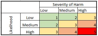
Companies utilize these risk assessment tables to identify and evaluate various risks and their potential impact on the organization. Each risk is categorized according to its likelihood (probability of occurrence) and severity of harm (impact). This closely resembles our method of selecting values for independent variables, where we choose them based on their probability and the sensitivity table reveals their impact.
This brings us to our next topic: the visual design of sensitivity tables. To enhance understanding, it is advisable to color either the results or the values of the independent variables. Coloring the cells should follow the following logic:
- Highlighting the range of probable outcomes: Use a single color with different hues, with the base case as the strongest hue and fading as values move farther from the base case. Additionally, color the values of the independent variables according to their probability, such as using green for the base case and red for the edge values.
- Highlighting problematic values: Color the results in red when they indicate an issue or problem. For example, if breaching debt covenants occurs when the LTV ratio exceeds 70%, color the results that exceed 70% in red (this can be easily done using conditional formatting in software like MS Excel). Additionally, you can use green to represent results within a certain range from problematic and yellow for values falling between the green and red ranges. For instance, LTV values below 55% could be colored green, while values between 55% and 70% could be colored yellow.
By applying these visual design principles, sensitivity tables become more intuitive and facilitate the identification of base cases, probable outcomes, and areas of concern.
A step-by-step guide on creating a sensitivity table in Excel:
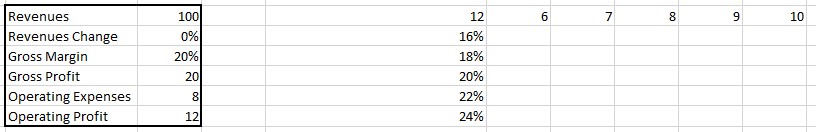
- Let’s use an example where we want to calculate the operating profit while considering gross margin and operating expenses as independent variables.
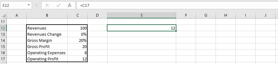
- Start by selecting the top-left cell of your table, which will be the cell referencing the dependent variable. In our case, it is the cell containing the operating profit calculation.
- In the first row and column of the table, enter the values for the independent variables. For instance, let’s use the values of 6 to 10 for operating expenses and 16% to 24% for gross margin.
- Select the entire table, including the first row and column.
- Go to the “Data” tab in Excel and click on “What-If Analysis” and then “Data Table”.
- In the data table dialog box, specify the cells that contain the independent variable values. The row input cell should reference the cell with the values in the first row (operating expenses in our example), and the column input cell should reference the cell with the values in the first column (gross margin in our example). Once you have assigned these cells, click “OK”.
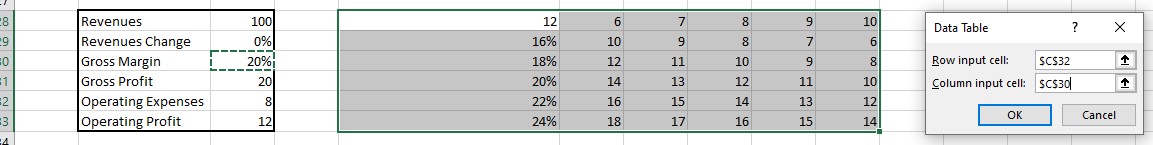
- Congratulations! You have created the sensitivity table. Now, you can add a title and apply coloring if desired to enhance the visual presentation.

- If you encounter any issues with the table not computing properly, first double-check that the row and column cells reference the correct cells. Additionally, ensure that auto-calculation of sensitivity tables is enabled in Excel. To do this, go to the “File” tab, select “Options”, and then choose “Formulas”. In the “Calculation options” section, make sure “Automatic” is selected under “Workbook Calculation”.
By following these steps and ensuring proper cell references and calculation settings, you can easily create a functional and visually appealing sensitivity table in Excel.
- Since my English is far from perfect, I used ChatGPT to improve the wording of this article after I wrote it.