This article will:
- Explain what is a histogram
- Explain how histograms can be used in financial analysis
- Showcase 3 examples of financial data analysis using histograms
- Explain how to easily create a histogram.
What is a distribution histogram?
A histogram, or a distribution histogram, is a chart that shows the distribution of numerical data. The most widely known histogram is the normal distribution chart, which we all know from studies of statistics:
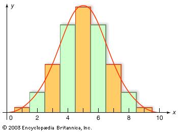
Histograms are a very useful tool for description and analysis of a large set of data, and is very easy to understand as it is a visual tool. If we can categorize the calculation of simple statistics such as average, median and standard deviation as the first step in numerical data analysis, then creating a histogram would be the next step. It provides a better description of the data and is a crucial part of data analysis.
When to use histograms
Financial analysis and valuation includes dealing with large sets of numerical data. This data includes, but is not limited to:
- Macro-economic indicators
- Financial statements
- Financial ratios
- Peer company data
- Stock returns
- Commodity prices
This data helps us analyze the company or industry, understand its history and current status, and make forecasts of the future. Large sets of data can be overwhelming and confusing, so we must use statistical tools- tools that help collect, analyze, interpret and present data. Histograms help us visualize the data and answer questions such as:
- How does current performance of the company, represented by financial ratios, compares to the past?
- How does the performance of the company, represented by financial ratios, compares to its peers?
- What was the historic behavior of macro-economic indicators, stock returns and commodity prices?
Since the histogram will show the distribution of the samples, we will use it when we want to understand if a specific sample or prediction (for example, current or forecasted gross profit margin) is common, or unusual.
Basically, a histogram would be useful whenever we want to calculate an average or a median of a data set. The histogram will present not only those statistics, but the whole distribution of the data, which will improve our analysis and can reveal conclusions which the average and the median will not show. One of the best examples of the importance of creating a histogram, and not relying only on the average and median, is the following two distributions:
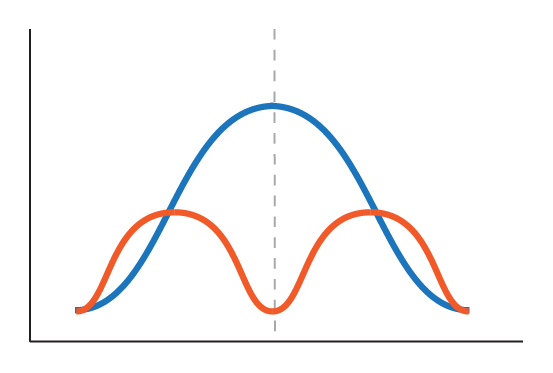
As you can see, the average and the median of those two distribution are about the same- but the histogram reveals a completely different story.
Histogram Use Example- Industry Analysis
Let’s try to analyze some aspects of the Food and Staples Retailers industry, since the recent acquisition of Whole Foods by Amazon put it in the spot light. I will perform an analysis of growth, profitability, valuation and financial leverage. I am using a sample of the 67 largest public companies in the food and staples retailing industry, which primary location is U.S., Canada and European developed markets. The minimum market cap of a company in the sample is 71 million USD. Some of the data and ratios I will use are missing for some of the companies, so some of the analysis will include less samples.
First, let’s look at past growth. I will analyze growth by using the revenues CAGR in the last 5 years for each company. First, I’ve created a histogram of the European sample (29 companies) and the U.S. and Canada sample (29 companies). I used the same bins specifications, so the results would be easily comparable. Following are the histograms:

Also, I computed the average and median for each geographical market:

The histograms show that the distribution of growth rates in the U.S. and Canada market differs from the European market. Since we want to focus on Whole Foods, let’s examine the U.S. and Canada market. We can see that very few companies exhibited a decline in revenues, and that the distribution of companies with growth rates between 0% to 10% is roughly the same. Also, not a negligible part of the sample exhibited a growth rates of above 10%.
The CAGR of Whole Foods was 8%. Using the histogram, we can see that a bit more than a quarter of the companies exhibited roughly similar growth, between 6% to 10%. It seems that although the average growth rate of Food and Staples Retailers in the U.S. and Canada was 6.2%, the 8% of Whole Foods is not that high or unusual. I would conclude that Whole Foods experienced a “normal” growth rate, comparing to other companies in the industry. Histogram analysis also helps us formulate questions for the next step of analysis- to understand if our conclusions are correct, and to understand the factors that influence them. In the case of growth, the next question to explore would be the driving force behind the growth in revenues- opening of new stores or same store revenue growth. We would also try to understand the reasons for the high growth rate of U.S. and Canadian companies located in the most right bin, with growth rates exceeding 10%.
Now, let’s look at profitability, as described by LTM Gross and EBITDA profit margins of companies in the sample. Same as with growth rates, I created histograms for European (32 companies) and U.S. and Canada (34 companies) markets with the same bin specifications. Following are the Gross Profit Margin histograms:

Also, I computed the average and median for each geographical market:

We can see that while the average and median are pretty close, the histograms show a bit of a different story. While the Gross Profit Margins of most of the European companies are in the range of 20% to 25%, the same profitability metric is higher at U.S. and Canadian companies. Also, fewer U.S. and Canada companies exhibit low Gross Profit Margins in the range of under 10%. One of the reasons for the difference might be different accounting standards so a more in depth research should be performed.
The Gross profit margin of Whole Foods was at 34.1%, which puts it in the most right bin of the histogram. This shows that not only their profitability is much higher compared to the average, it is also an untypical result. Since Whole Foods positions itself in the upscale part of the Food and Staples Retailing industry, we would continue the analysis by comparing it to other companies located in the most right bin.
Now, let’s check the EBITDA margins of both geographical markets:

And the average and median:

We can see that the European market shows a distribution which is quite similar to a normal distribution, so the average of 5% provides a good description of the sample. The U.S. and Canada sample, on the other hand, shows a high variability of EBITDA margins, which makes the average and median useless in describing the sample.
The EBITDA Margin of Whole Foods is once again located in the most right bin of the histogram, with 8.4%, which strengthens our conclusion regarding the superiority of its profitability compares to its peers and the need for farther analysis to understand the reason for this performance.
In the next part, we will look at the valuation of the companies, as described by normalized P/E ratios. Following are the normalized P/E histograms for the European (26 samples) and U.S. and Canada (30 samples) markets:

And the average and median:

We can see that the distribution of normalized P/E ratios if Europe much differs than the U.S. and Canada market. In Europe, the normalized P/E of most companies is located in the range of 12 to 36, with an even distribution in that range. We can conclude that the drivers of P/E ratios in the European market varies from company to company. This means that an analysis of a specific company requires a research of its own value drivers, as the average of the market shows little about the P/E required by investors in specific companies.
In the U.S. and Canada market, the histogram shows an interesting story. By looking at the histogram, we can conclude that 3 major segments of normalized P/E ratios exist:
- The low range with ratios between 12 to 16
- The medium range with ratios between 20 to 32
- The very high range with ratios above 36
This segmentation encourages an analysis of the companies in each segment in order to find their similarities. We would like to understand the differences between the characteristics of companies in each segment. The average for the U.S. and Canada sample, 29, is close to the normalized P/E of whole foods (28.9), but as shown by the histogram, this hardly reveals the real story.
The final part of the example is the analysis of financial leverage, as described by the ratio of Debt to LTM EBITDA. Due to the use of different accounting standards, it should provide a better representation compared to Equity to Debt ratios. Following are the Debt to LTM EBITDA ratios for the European (31 samples) and U.S. and Canada (34 samples) markets:

And the average and median:

Histogram Use Example- Company Analysis
As we have seen, the histogram is an efficient tool to compare a specific sample to a data set- in the previous example, the parameters of a company to its industry. The same can be applied to the current performance of the company- we can compare it to its performance and operational metrics in the past.
Since we started with Whole Foods, let’s perform an analysis of growth, profitability, valuation and financial leverage of the company over time. The analysis will be executed by using analyzing a histogram of historic metrics and viewing the trend over time. We will use the financial statements and supplemental data of Whole Foods from 1997, the first year with revenues above 1 Bil USD, until today.
The growth of a retail company is analyzed by using 2 major metrics- growth in the quantity of stores, and growth in revenues per store (same store sales). First, let’s look at the growth in stores over time, both in terms of quantity and as a percentage of total stores:
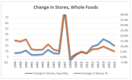
We can see that in 2007 the number of stores increased significantly due to acquisition of 109 stores (some of which were sold). Other than this exception year, the number of new stores each year showed an increase over time, while the ratio of new stores to total stores decreased. This make sense since the company ended 1997 with 75 stores, and owned 456 stores at the end of 2016. To be able to grow at the same pace with hundreds of stores, compared to several dozen, will be a very difficult task and is not likely. Since the decrease in the growth rate is not a negative finding, it seems that it is the best indicator to look at, compared to change in quantity. Now let’s look at the histogram and try to make conclusions regarding the growth in recent years:
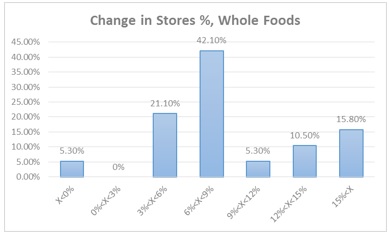
There was only one year with negative growth, and few years with high growth with a rate of over 15%. As we look at the chart which shows the trend over time, we can see that the high growth periods are the first years of our data set. Except those early years, growth was in the range of 3% to 9%, with the majority of years in the range of 6% to 9%. Those findings show that the growth rate in 2016, 5.8%, is relatively common, and we can expect the company to increase the number of stores in that pace, or a bit higher. Now let’s view the second growth parameter, revenues per Sq.F. Following is the trend over time:
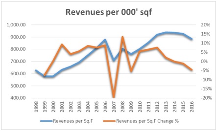
The trend is positive most of the time, except a decrease in the period of 2007 to 2009 and in the last several years. The decrease in 2007-2009 can be explained by the acquisition of very high quantity of stores in 2007, and by the economic crisis in those years. The decline in the revenues per Sq.F. in the last 3 years is a topic for a more in- depth analysis. Now let’s view the histogram:
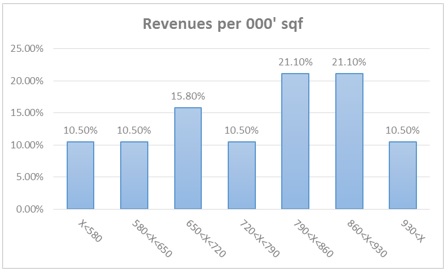
The histogram shows that the most common range of revenues per Sq.F. is between 790 to 930 million USD to 000’ Sq.F. This figure stood at 883 million USD at the end of 2016. It means that while the trend shows a decline in recent years, the absolute level is not abnormal. Those two indicators show that further investigation is required, but the histogram also shows that the recent downward trend might not continue. As you can see, in analyzing historical data, using both time trend analysis and histograms can produce valuable insights, which might not be reached by using only one method.
Let’s take a look at the profitability margins of Whole Foods, and see what conclusions we can draw and what questions would come up. Following is the historic data of Gross Profit Margins and EBITDA Margins:

The behavior of both margins is roughly similar over time, with a relatively low variability of both ratios. Profitability peaked at 2013, the year of the peak in revenues per Sq.F, which is logical, and declined since then, same as the revenues per Sq.F. The histogram shows that in this case, the average gross profit margin of 34.6% is a good representative of the sample, so we probably can expect it in the future:

The behavior of both margins is roughly similar over time, with a relatively low variability of both ratios. Profitability peaked at 2013, the year of the peak in revenues per Sq.F, which is logical, and declined since then, same as the revenues per Sq.F. The histogram shows that in this case, the average gross profit margin of 34.6% is a good representative of the sample, so we probably can expect it in the future:

The next part of the example is to analyze the leverage of Whole Foods over time. Following is the Total Debt to EBITDA ratio of the company:

The trend chart shows that leverage evolved in line with the growth of the company. The high growth in the number of stores in the 1998-2000 period was executed by using debt, and so is the acquisition of stores in 2007. It is interesting to see that management does not maintain a steady level of leverage, but decreases it to 0 when it is not used to expand growth. Although the level of leverage is very low, the analyst should investigate the increase in leverage in 2016, since it was not a year of exceptionally high growth. In this case, the histogram does not reveal new information that cannot be understood from the trend over time.
And the final part is the analysis of the valuation of Whole Foods in the market. Following are the trend of the normalized P/E ratio over time, and its histogram:

Histogram Use Example- Stock Market Returns Analysis
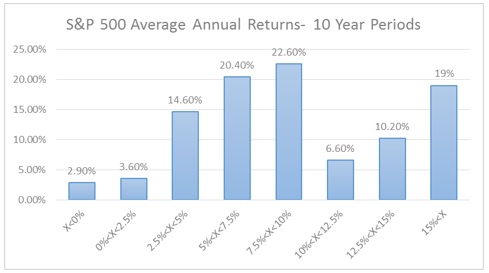
Let’s look at the historic returns of the S&P 500 index in 10 year periods. I will use returns data from 1870 to 2016, which means that the data set includes 137 samples of 10 year periods, with the first ending in 1880. Following is the histogram of the average annual returns of the 10 year periods:
How to easily create a histogram?
Histograms are composed of bins- each bin specifies a range which starts at the end of the range of the bin before. The basic specification of a histogram is:
- The end of the range of the first bin. For example, -5 for a bin which will include all samples smaller than 5.
- The beginning of the range of the last bin. For example, 5 for a bin which will include all samples larger than 5.
- The number of bins. The basic histogram includes evenly distributed bins, so no individual specifications of the inner bins is required.
If we don’t want evenly distributed bins, we need to specify the range if each bin. You can create a histogram in excel by specifying the bins and using the function “COUNTIF” to count the number of samples in each bin. Then, divide the number of samples in each bin by the total number of samples to receive the distribution. Another, and an easier option, is to use tools such as the Histogram Builder by Analystix.
Our goal at Analystix is to improve and ease your financial analysis and valuation methods and workflow. We developed the Histogram Builder Excel Add-in, a tool that helps you create histograms and is available for free as part of the Analystix Tools Excel Add-ins package. The Histogram Builder shows description statistics of the selected data set, and provides data that can help you determine the bins specification. Then, you can choose to use those suggested bins specifications (first, last and number of bins) or input your own. The Histogram Builder will create a data specification of the histogram, which you can change. You can output the histogram data specification and automatically create a bar or line chart, and even create an output of the whole data sample, organized by bins. Following is an introduction video of the Histogram Builder, which includes an example of its use:
The Analystix website includes tutorials for the use of the Histogram Builder- a video tutorial and a step-by-step tutorial with screenshots. You can access it by clicking here.

